My idea and the realization.
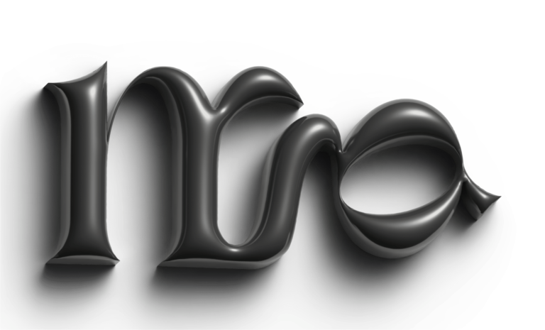
I chose to create my monogram with the Sonder font, a font used by Coachella, the famous Californian festival, in 2022. It’s the one you see above as the title.
I selected this font for its strongly slanted strokes, which add movement. It combines roundness with slender serifs.
Initially, I tried to merge the uppercase M and G, where the G’s stroke would become that of the M. However, it didn’t work perfectly. There were too many elements to focus on the essentials, and the combination was too simple to represent my creativity.
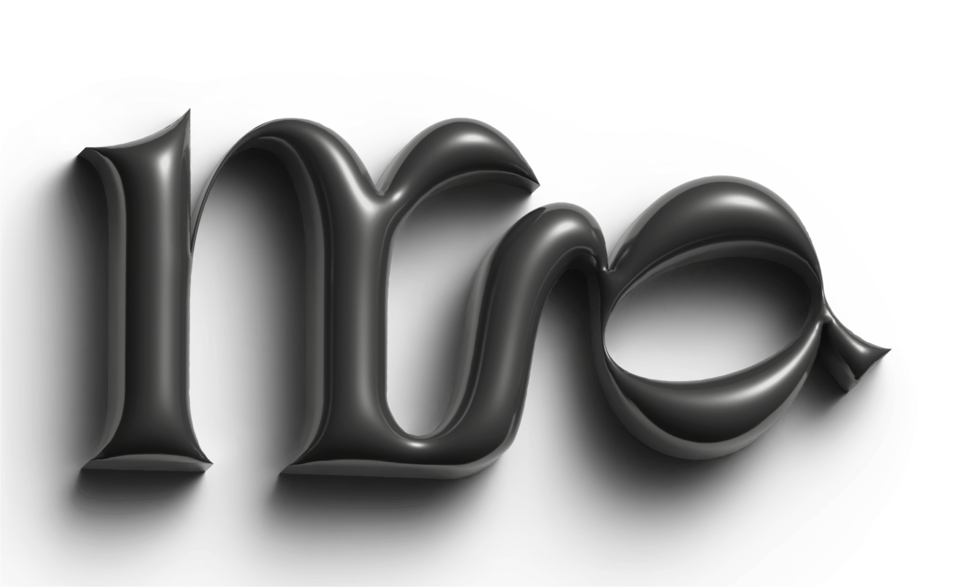
After several attempts, I chose to combine the lowercase m and g, my initials. By flipping the g, an interesting shape emerges, where the connecting stroke for the g transitions into the m, which retains its serif.
My objectives.
- To have a discreet and elegant logo.
- To be able to identify myself easily.
- Create a unique brand identity.

And the result ?
I chose to create a 3D monogram, playing with shadows and the metallic effect used.
Past projects
Here you will find all the projects that have been decisive
during these first years of study.
during these first years of study.
